Kroger Product Finder
2024

Project Duration
2 months
My Roles
UX Designer
Visual Designer
My Skills
Conduct User Research
Ideate Design Ideas
Create & Test Prototypes
Project Overview
About Kroger
Kroger is a retail company that operates supermarkets and grocery stores throughout United States. Being the 3rd largest supermarket chain in the country, it operates over 2,700 grocery stores in 35 states.
The Problem
Shoppers often struggle to locate products in grocery stores like Kroger, leading to frustration and waste of time. This problem result in a less efficient and more stressful shopping experience. The lack of an effective in-store navigation solution makes it challenging for shoppers to quickly find what they need.
30 million
people in the US visit grocery stores every day.
41 minutes
is the average time for people to shop at grocery stores.
67.3%
of shoppers struggle with not buying the items they needed because they couldn’t find them.

Aisle signs at Kroger - Are they really that useful?
The Current Solution
Kroger has its website for users to look up for the location information of specified products. However:
- Complicated user actions are needed to reach the location info of products
- Overwhelming UI elements
- Many products are missing location info

The Goal
Help shoppers to easily find the the products they are looking for.
My goal for this project is to create an effective digital solution that enables grocery shoppers to efficiently search and locate products in-store, allowing them to save time and reduce frustration to improve their overall shopping experience.
1
Empathize with target users, understand their needs and pain points
2
Focus on simplifying UI design and user flow, creating a smooth user experience
3
Emphasize accessibility, ensuring the system accommodates a wide range of user groups
Design Process

Project Outcome
Key data gathered from second-round on-site usability tests:
19s
Average time spent on finding the location info of a product on the device
↓44%
Less time spent on locating a product in-store, compared to the mobile website
↑20%
Increase in success rate on completing an individual task, compared to the website
User Research

Overarching Question - User Research
What are the key factors that make it challenging for shoppers to find their desired products? What are the thoughts and behaviors when they do so?
5 interview participants were recruited from the neighborhoods where Kroger serves as their primary grocery shopping destination. The interview questions were structured around 3 key sections:
- Shopping Behavior & Habits
- Challenges in Product Location
- Expectations & Preferences for a Navigation Solution
Key Pain Points Discovered
1
Shoppers struggle with locating products due to unfamiliar store layout and frequent changes in place.
2
Complex process is needed to find a product's location info on the mobile website.
3
Shoppers are unaware of a product's inventory status.
4
Shoppers want a fast, simple, and accurate product location solution.

User Personas
Then, I synthesized interview insights and key pain points to create representative Kroger shopper's profiles. They will provide a deeper understanding of the target user's needs, behaviors, and expectations when shopping and locating products.


(Click to enlarge)
Ideation Process
Overarching Question - Ideation
How can I allow shoppers to search for a product and find its location info quickly and efficiently, minimizing interruptions to their normal shopping flow?
User Journey Maps
User journey maps aimed to understand the complete experiences the personas will have when shopping groceries at Kroger. Through the maps, I wish to further empathize the shoppers' feelings at each task, as well as underlying opportunities to solve their pain points.


(Click to enlarge)
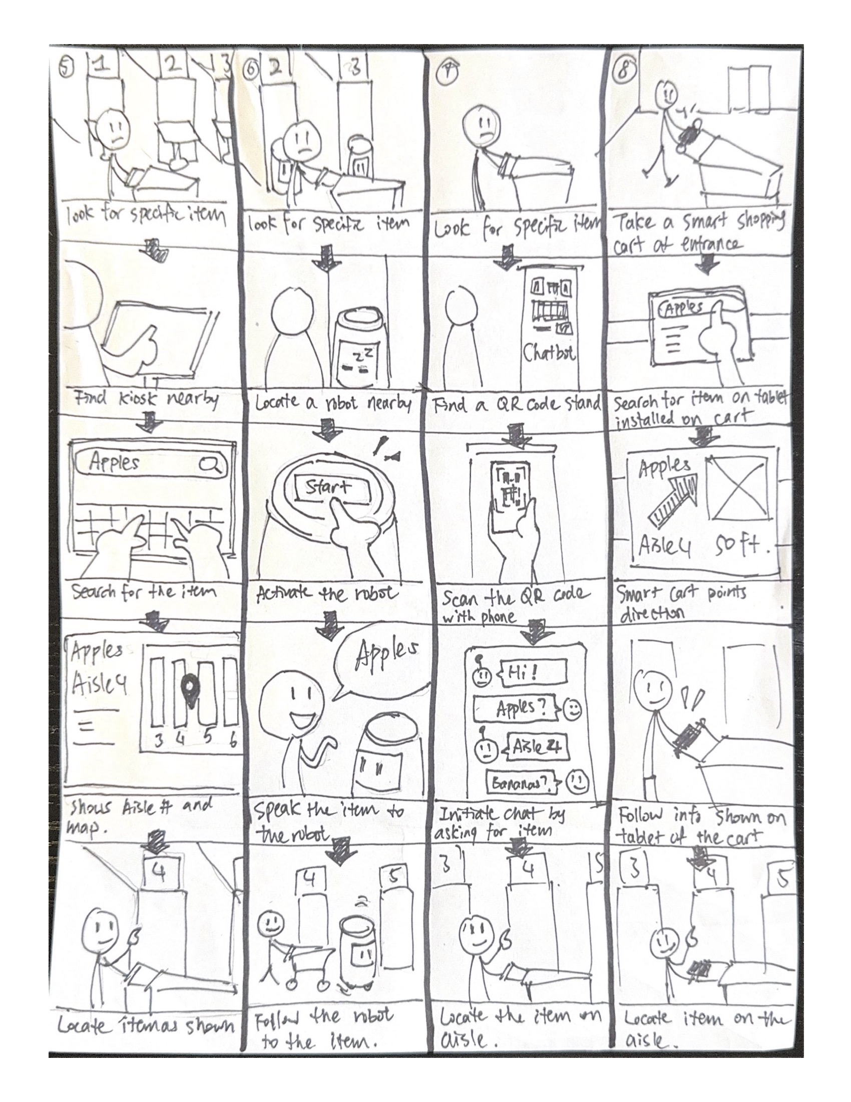
Brainstorming + Storyboards
I brainstormed 8 digital solutions that might improve shoppers' product location and in-store navigation experience. There is a 5-frame storyboard for each solution to visualize user interactions. I aimed to determine which solutions are the most efficient and effective to be deployed.
Among the 8 ideas, I believe the self-service kiosks will be the best solution, considering its ease of deployment, cost-effectiveness, and efficient user flow.

QOC Analysis
I conducted a QOC (Questions, Options, and Criteria) analysis to help brainstorm design solutions and assess some trade-offs for certain design choices.


(Click to enlarge)
User Flow Diagram
The user flow diagram helps visualize key interactions. I want to ensure that the item-searching and locating process on the kiosk app is simple and efficient, minimizing the time and effort users spend finding items.

Design Process
Overarching Questions - Design
- What existing information provide users more accurate location info than just aisle numbers?
- How can I lay out the interactive elements to ensure a smooth and intuitive experience while using the kiosk?
Design Rationale
Kroger stores use a two-level location system on its products: aisle numbers (first level) and section names within each aisle (second level). While this system helps shoppers find products, they still struggle to find specific items because they may not know which category a product falls under.
To address this, I leverage the system as a indicator of product location rather than relying on category knowledge. When users search for a product on the Product Locator Kiosk, it displays both the aisle number and the section name. It provides more accurate location details and making in-store navigation easier.

Aisle signs at Kroger

The sections within each aisle
Deployment Strategy
This product search application will be carried on light-weighted floor stand kiosks. The stands will be evenly distributed in the store every 2-3 aisles, on both sides. I want to ensure shoppers to easily access a device from any corner of the store, while minimize the risk of obstructing foot traffic.

Bosstab Elite Evo Floor Stand

Visualization of Distribution in store
Wireframes & Prototypes
I sketched wireframes to quickly visualize and test different design layouts of the product search kiosk's user interface. Then, they were transformed into digital low-fidelity and high-fidelity prototypes to test key user interactions on the product search process of the kiosk.


(Click to enlarge)
Visual Identity Study

High-Fidelity Prototypes - v1
The high-fidelity prototype integrates low-fidelity prototypes and the visual identity study to create a polished design that is close to a finished product. This approach ensures the user feeling fully immersed during the upcoming usability tests.
Usability & A/B Testing
I want to test the current design's usability and user interaction to uncover problems and opportunities for improvement. I recruited 4 current Kroger shoppers for a usability test and were given a list of specific tasks to do or goals to achieve on the prototype. Their thoughts and feedback were then collected and analyzed.

A/B Testing
In the usability test, 2 participants are given the "scrolling" version when browsing search results, and the other 2 are give the "flipping" version. I want to test how users behave differently in these methods, and which method helps users find their desired products more efficiently and with fewer errors.
Scrolling
Page Flipping
Results show that the paging group find their desired product quicker and more accurate. This method provides less cognitive load by limiting the number of choices at a time, and allows users to keep track of their position while browsing.
- The paging group locate the target product 33% faster than the scrolling group.
- Both scrolling group participants attempted to scroll back to check whether they had missed something
- Both groups had no problem understanding the interaction method
Final Design
This final design flow is dedicated to simplifying user interactions. It ensures the user reaches the endpoint (the product page) within a few steps. The design strictly follows these principles:
- Prioritize simple tap interactions; avoid complex gestures such as swiping or pinching
- Ensure content is large enough to be easily read or recognized
- Minimize cognitive load by avoiding cluttered or complicated UI elements
Core User Flow
1
Keyword Search
User searches for a desired product in a familiar way: the search bar. It provides the most accurate results because the keywords input can be very specific.
2
Search Results
User browse the products from search results in a grid layout. They can flip between pages and apply filters or sorting preferences.
3
Product Page - End Point
User selects one of the products to see its product page. The product's aisle number and section is highlighted to attract user's vision in a glance. The page also includes other helpful information such as inventory status and store map.
Additional Features

The Store Map
The store map labels a product's location on the map and the path from the user's current position to the product. It visualizes spatial relationships and makes in-store navigation even faster.

Browse by Category
User can browse the categories and sub-categories as an alternative method to find products, especially if they don't know the name of a product.

Speech to Text
This accessibility approach allows users who are unable or uncomfortable typing to input keywords by speaking to the kiosk.
Project Outcome
To test the outcome of this project, I conducted a on-site usability testing with 4 participants at a Kroger grocery store. The test result of using the kiosk app is compared to the existing Kroger website. Some outstanding data are as follows:
19s
Average time spent on finding the location info of a product on the device
↓44%
Less time spent on locating a product in-store
↑20%
Increase in success rate on completing an individual task
Conclusion
Key Takeaways
Through this project, I learned how to identify real-world user needs and pain points through user research and brainstorm digital solutions that address those needs. I also learned to utilize UX design methods to evaluate and support my design decisions. Additionally, I approached accessibility carefully and thoughtfully to ensure the product is inclusive for a wide range of user groups.