
Business Growth
User Retention
2025
MY ROLE
UI/UX Designer
DURATION
3 Months
COLLABORATORS
Design Director
Product Manager
Software Engineers

AT A GLANCE
About the project
Jack Applies, Inc. (Jack) is an automated job application platform that automatically applies to jobs on users’ behalf based on their preset preferences.
In this project, I focused on redesigning key product experiences to help users get started with Jack, maintain engagement throughout the subscription period, and ultimately support the platform’s long-term growth.
My role
I worked as a UI/UX Designer in a team of 3. I collaborated closely with a Senior Product Designer and a Product Manager. I also partnered with the development team to ensure my design solutions were accurately implemented.
OUR USERS

Early-career job seekers who apply in bulk
They lack the time and energy to submit large numbers of applications, and finds repetitive form-filling and filtering both time-consuming and stressful. They wish to streamline their job search by using Jack’s features to automatically apply to relevant roles, saving time while increasing their chances of landing interviews.
THE PROBLEM
THE RESULTS
The project spanned three months, during which we successfully achieved our short-term business goals through iterative design improvements.
Relative growth
Relative decline
Interactive prototype
Interact with job cards, Autopilot switch, membership, and application history.
THE PROCESS
1
Exploration
Explored data and early design solutions to get quick insights
2
Validation
Tested design through user research and data to get clear focus.
3
Iteration
Refined the design based on insights and performance metrics.
Exploration
After initial conversations with stakeholders, I identified key usability gaps and implemented quick design improvements. This allowed us to get quick impacts and validate assumptions before investing in deeper research process.
Validation
To further validate our assumptions and gain insights of future iterations, we identified 2 groups of Jack's previous users that were affected by our current problems. We recruited 5 participants for each group, conducted 15-minute interviews, and identified key friction points users encounter while using Jack.
User Group 1
Non-subscribers
Signed up but did not start applying.
They don't to see Jack’s differentiated value and question its reliability, resulting in low motivation to get started.
⚠️ Low Motivation
“I don’t really see how this is different from other job platforms. I’m not convinced it’s worth paying for.”
⚠️ Low Trust
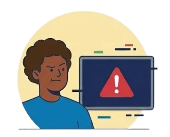
“The interface feels a bit rough. Made me question whether this platform is reliable to apply to jobs.”

⚠️ High Learning Curve
“I wasn’t sure what I was supposed to do first. The features sounded powerful, but I didn’t know how to actually use them.”

User Group 2
Ex-subscribers
Subscribed but unsubscribed shortly.
They lacked clear progress feedback and tangible results, leading them to question Jack’s value and lose confidence.

⚠️ Low Sense of Security
“I turned on autopilot, but I kept wondering if my applications were really being sent.”
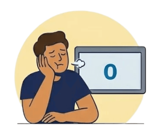
⚠️ Diminished Confidence
“I didn’t see much feedback or progress, so it felt like nothing new was happening.”

⚠️ Weak Connection
“When I didn’t hear back from any applications, I feel discouraged and questioned whether this platform even helps.”
Pivoting the product strategy
The insights from our research revealed a consistent gap between Jack’s capabilities and users’ perception of its value, highlighting the need for a strategy that supports users both before and after they subscribe.
Clarify Jack’s core value early, build trust, and motivate users to take their first actions.
Ensure users consistently feel the subscription is worthwhile by making benefits, progress, and outcomes visible.
Drive sustained subscription adoption and retention, ultimately supporting long-term, sustainable business growth.
Translating strategy into design
Based on these insights and strategic goals, I translated key problems into targeted design solutions to improve usability, clarity, trust, and overall user experience while supporting engagement and retention.
Click to navigate in-page
Highlighting key features to reduce early friction

Product Manager
Users don't see Jack's core features once they enter the home page. We want to highlight the features on the home page and encourage users to try them out. The goal is to reduce friction early on and raise Day-1 Activation Rate on job-applying features.
When the user discovers a feature, it means…
User has less friction to try features after initial exploration
User perceives the value of the features and adopt early
User gains reliance on Jack in job-hunting
User is willing to subscribe and conversion rate increases
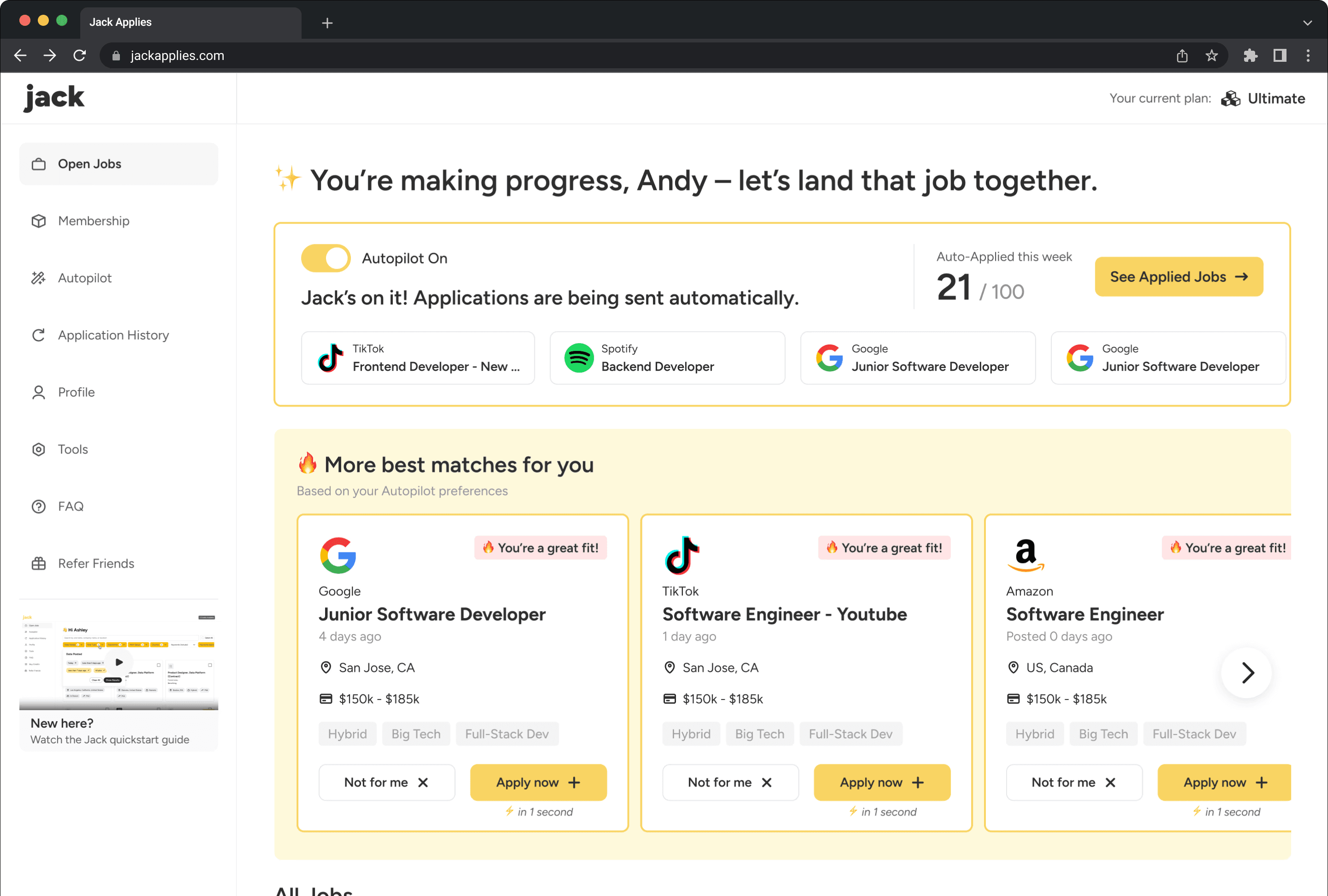
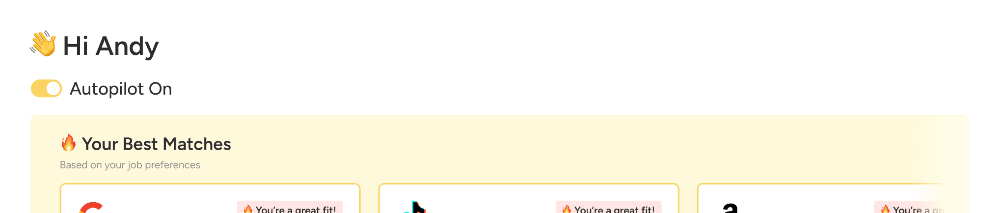
User now can easily discover key features on the home page
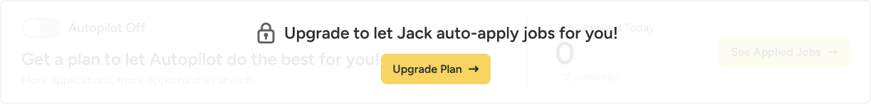
BEFORE
⚠️ Lack of feature visibility
Jack’s features were not visible on the homepage. Users discover these features by themselves, which increases friction during their initial exploration.
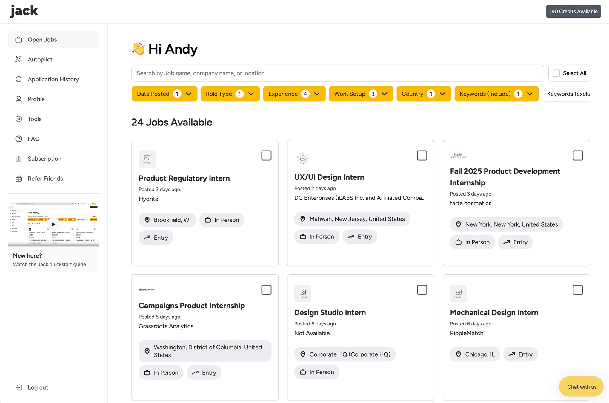
AFTER
✅ Action banner to encourage setup
Clearly guide the user to set up Autopilot to encourage early activation.
✅ Introduce “Best Matches” section
Highlight job posts with high matching scores, clearly communicating the Advanced Job Match feature and prompting quicker action.
Day-1 Activation Rate
% of users who applied or enabled Autopilot within 24 hours of signing up.
26%
Click to navigate in-page
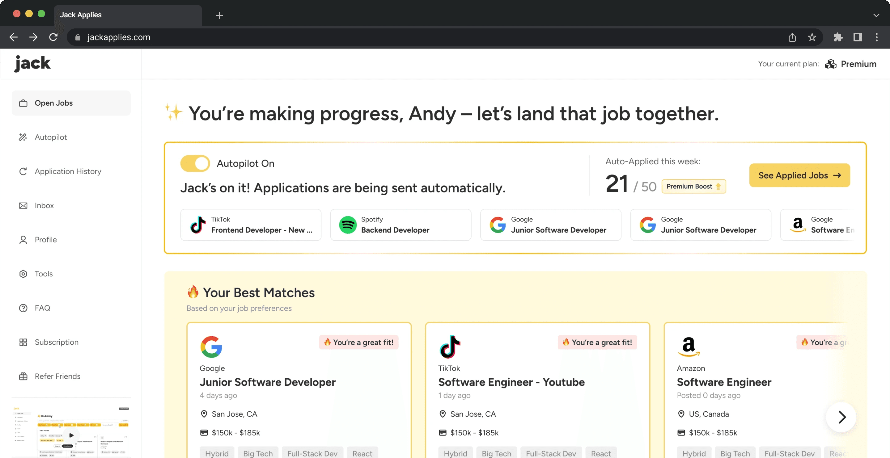
How could we maintain user engagement after the user subscribes to Jack?
Underscoring application status to ensure sense of security
Product Manager
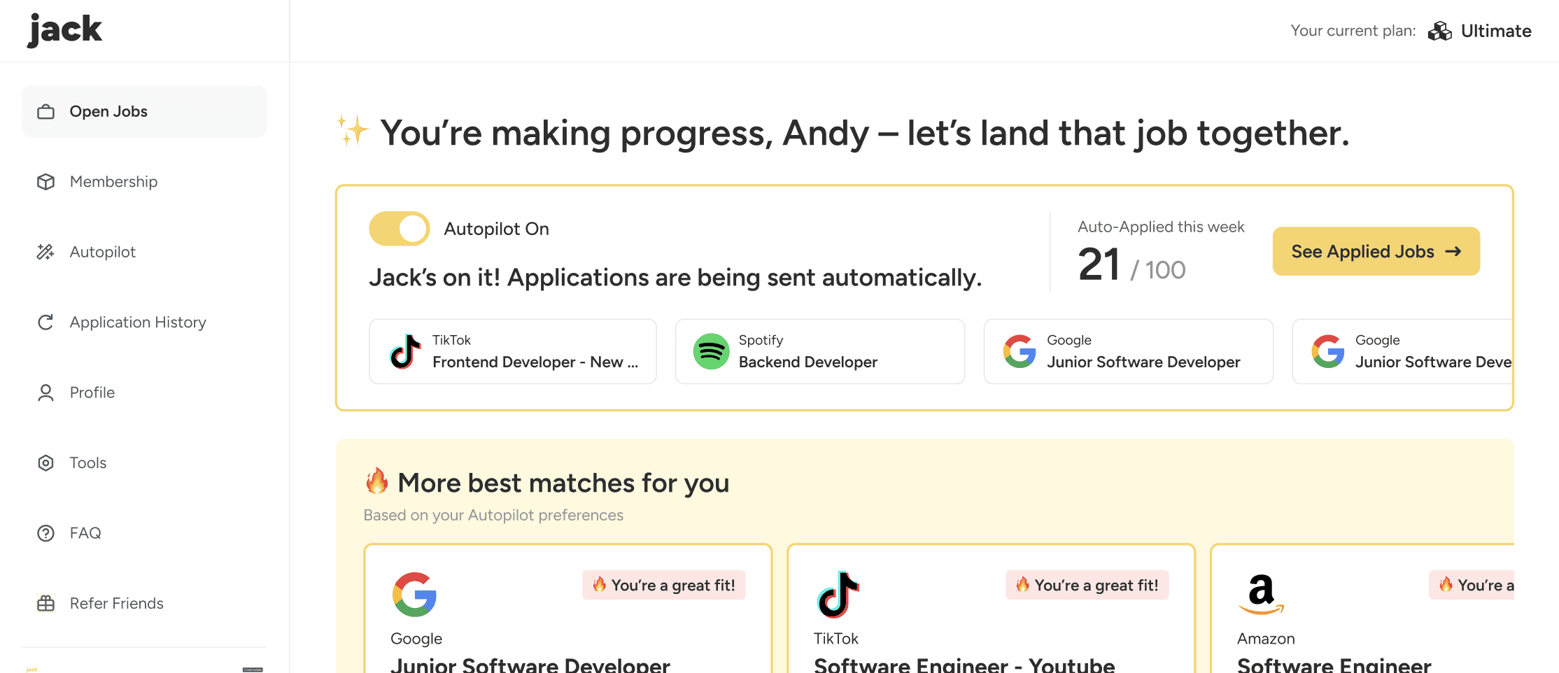
Users are unsure whether Autopilot was active and whether applications were actually being sent. We need to ensure users see Autopilot status easily and let them feel secure during job-applying.
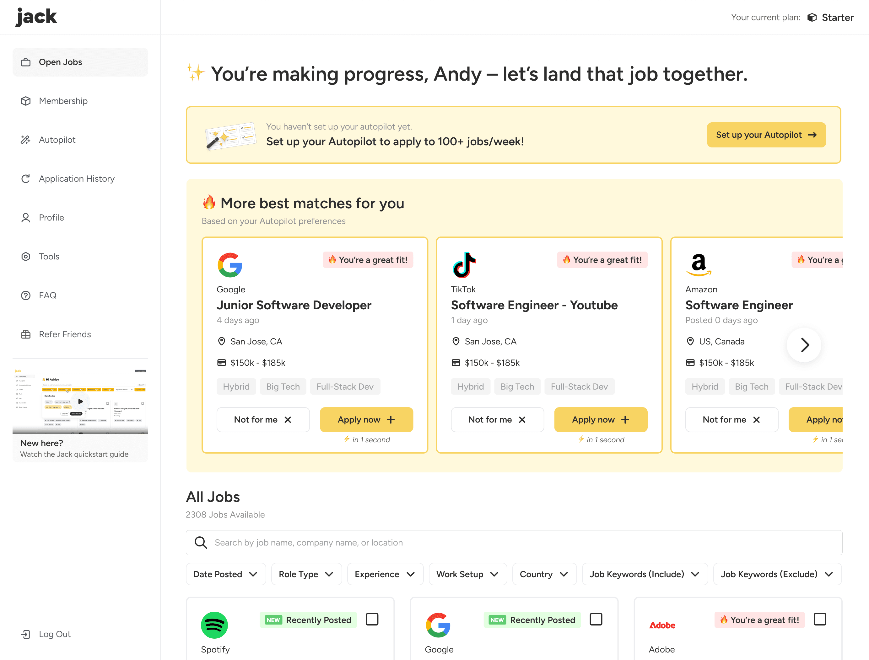
If the user sees how the Autopilot performs, it means…
User sees that Autopilot is actively applying
User increases trust and confidence
User perceive stronger long-term value of Jack
User continues to use Jack and retention increases
User now can easily see Autopilot's application progress
On our first iteration, we added a simple On/Off icon near the top of the home page to reveal Autopilot status ...
Then we took a step further to highlight Autopilot status and a preview of applied jobs, allowing the user to fully see the effectiveness of Autopilot at a glance.
Reinforcing value to secure confidence and retention

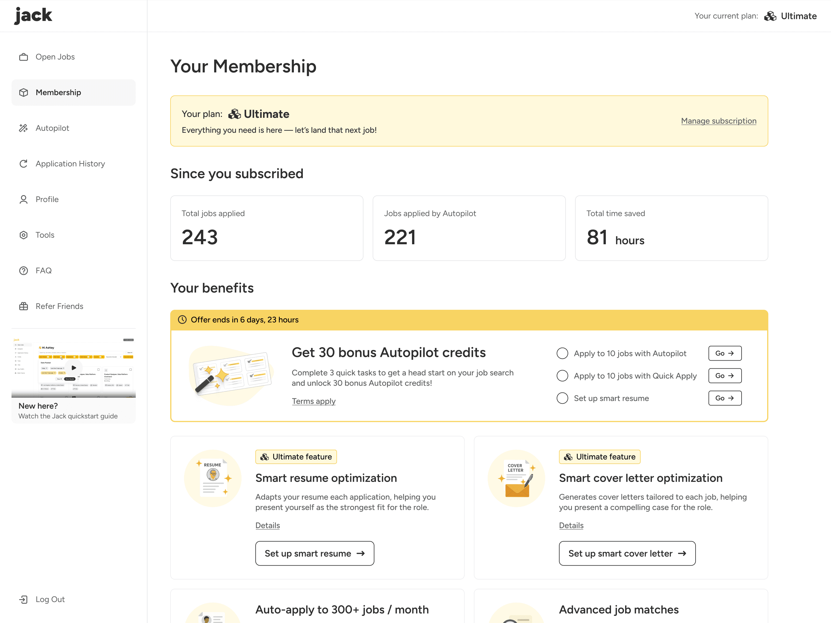
CEO
If subscribers don't feel their investment is worthwhile, churn increases and the perceived ROI drops. We want to protect retention, increase customer lifetime value (LTV), and secure long-term revenue growth.
If the user sees the benefits and impact of their subscription, it means…
User tries additional benefits
User sees how Jack contributes to job applying
User sees the long-term value of their subscription
Higher chance of retention and increased ROI
Subscribers now can clearly see their benefits and impacts
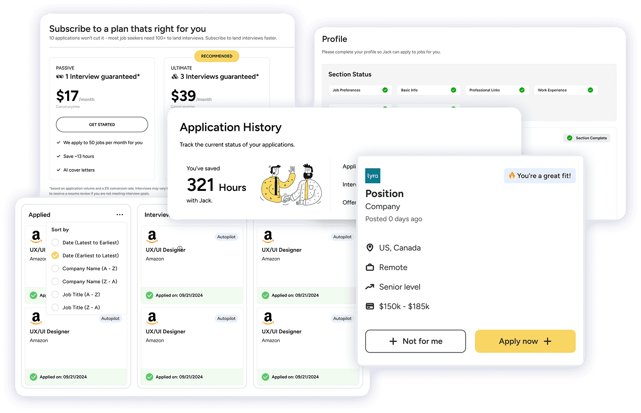
We introduced a dedicated “Membership” page where users can clearly see subscription impact and explore exclusive features in one place. By visualizing progress and benefits, the page reinforces the value of Jack’s subscription and encourages continued engagement.
Feature Activation Rate
% of subscribers who activated at least one paid feature other than Autopilot
44%
Click to navigate in-page
How might we turn initial user engagement into consistent conversion growth?
Promoting subscription clickthrough to increase conversion
CEO
A lift in conversion rate directly increases recurring revenue at scale. We want to eventually increase revenue so Jack can have a sustainable growth.
Total Active Users
% Subscription Page Visits
% Page Conversion
MRR
The lift in % of subscription page visit and the subscription page conversion rate would both boost the MRR eventually. So my design iteration will focus on lifting these key metrics by:
Simplifying the path to the subscription page to reduce friction
Highlighting value on the subscription page to promote conversion

Andy (Me)
User now can access the subscription page through multiple paths
CTAs across key touchpoints constantly remind users about subscribed features, making subscription page easy to reach any time.


Subscription Page Visit Rate
% of users who activated visited the subscription page
71%
User now can see the core values of subscription more clearly
Re-designed the subscription page to communicate the core values and benefits of paid plans to encourage subscription.
🎯 THE CHALLENGE
The trade-off between user experience and conversion effectiveness
Designing the subscription page required balancing a clean, trustworthy user experience with persuasive elements that drive conversion without being overwhelmed or pressured.
We created two approaches to compare their impact on decision-making and subscription intent.
User-centered approach
Cleaner layout, fewer distractions, minimizing cognitive overload during decision-making.
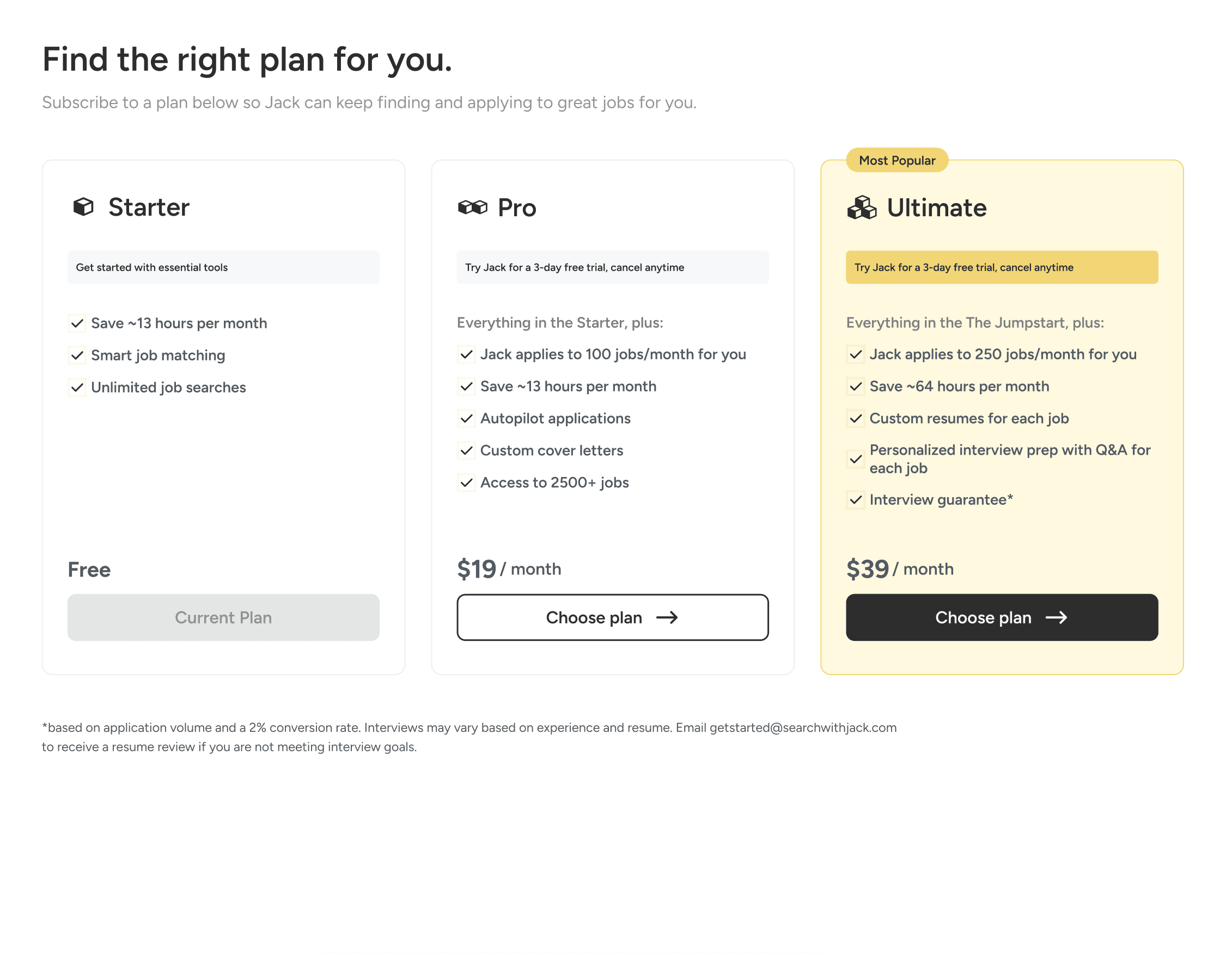
Final choice
Conversion-centered approach
Enhanced contrast to stimulate attention, encouraging users to make decisions quicker and more efficiently.

Additional design contributions
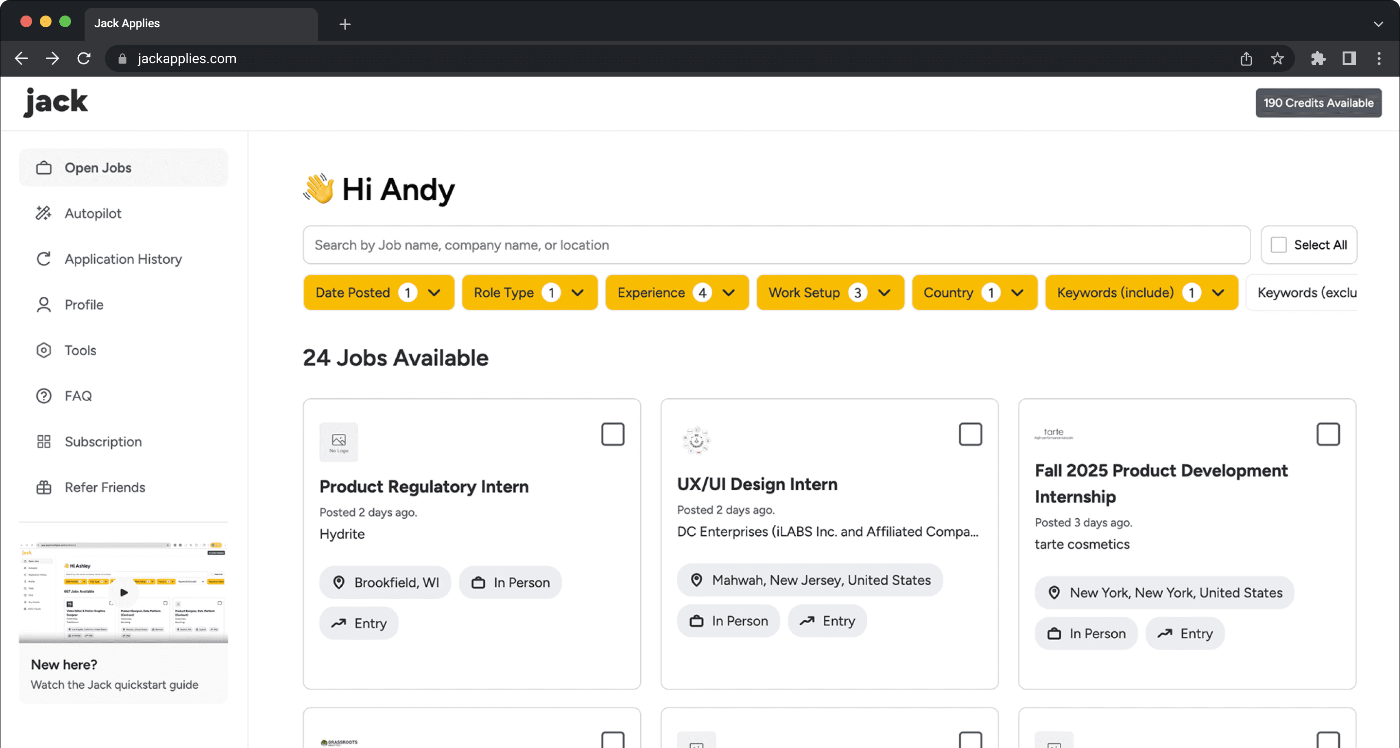
Make application history filtering easier
Optimized the filtering system for applied jobs by introducing tabs for different application types, with search and time filters as supporting controls.
The optimization makes it easier for users to view, manage, and track the progress of their applications.

In progress
Link user's email inbox to strengthen feedback
The email inbox page connects to the user’s email account that analyzes application-related messages and extracts key details, providing clearer visibility and feedback on application outcomes.
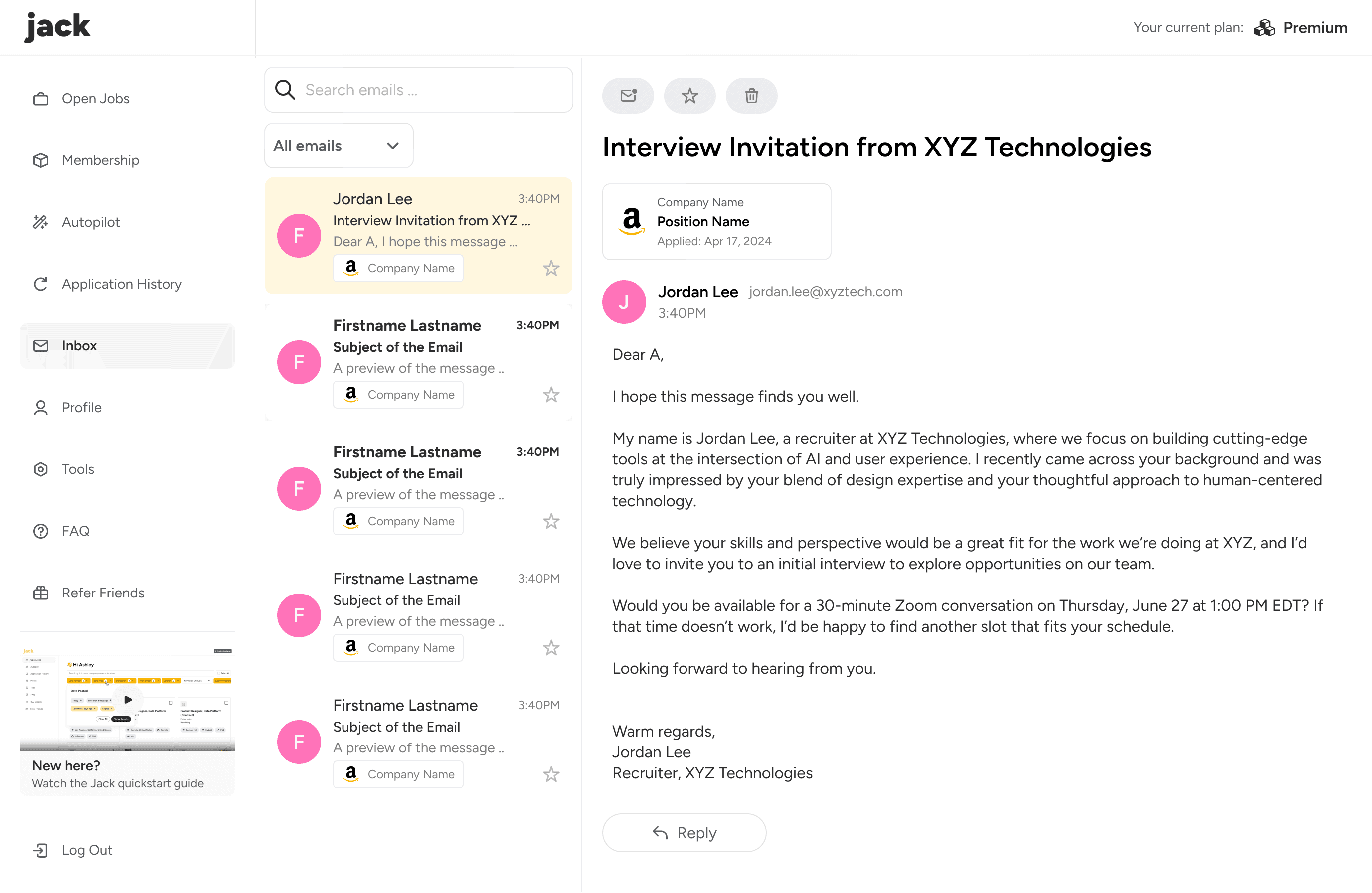
In progress
Employer dashboard
In the next phase, we plan to introduce recruiters and employers to host job openings on Jack, focusing on improving candidate filtering and bulk management to make hiring workflows more intuitive and efficient.
THE OUTCOME
1 month after my internship at Jack, our design have achieved:
Relative growth
Relative decline
KEY TAKEAWAYS
Summary
This project significantly improved the overall user experience of Jack while increasing subscription conversion and user retention. As the user base continued to grow, these improvements also contributed to more sustainable business development.
What did I learn?
Balancing user needs with business priorities. Decisions such as how prominently to highlight subscription benefits required careful trade-offs. I learned to align user-centered design with measurable business growth.
Thinking from real user insights and business metrics. By analyzing key metrics and user behavior, I realized that design goes beyond UI improvements—it requires identifying the factors that truly drive user experience and business impact.
Next Steps
As Jack’s user base continues to grow, future improvements can be further driven by key metrics and user feedback. By continuously tracking and analyzing user behavior, we can refine the experience more precisely while supporting long-term business strategy and sustained growth.

